
Education Website Redesign
This project was completed in collaboration with Creative & Creator as part of a larger team effort.
My Role: Associate UX Researcher and Designer
Duration: 10 months (June 2024-April 2025)
Tools: Figma, Miro, Google Slides, WordPress, Elementor
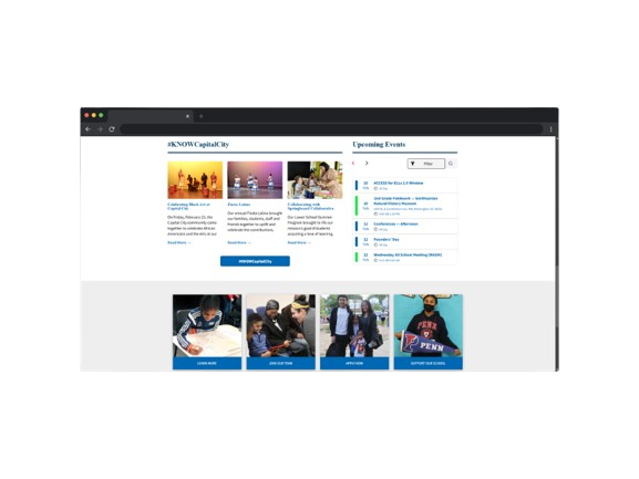
The project aimed to redesign and develop Capital City Public Charter School's (CCPCS) website to better represent its brand, enhance user experience, and improve engagement with key stakeholders. The website serves as a resource for families, students, educators, partners, and donors, providing clear navigation and a compelling user-friendly experience. By understanding the needs of these key audiences, we were able to make informed revisions that drove engagement and fostered stronger community connections.
Project Overview


Outdated
Poor design/layout
Hard to navigate
Difficult access to resources
Insufficient information on school programs
Lacks uniformity
Doesn’t meet accessibility needs
Lack of information in Spanish
Poor mobile experience
Current Challenges and Pain Points
Proposed Solution
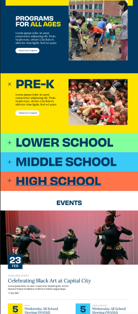
Modern redesign
Responsive
Ability to be fully translated into Spanish
User Friendly
Streamlined navigation
Restructured IA
Centralized location for educational resources
Integration, accessibility, and support for digital tools
Fully translated website content
Basic orientation and guidance for new parents
Simplified navigation
Integration and support for digital tools
School newsletter integration
Recommendations and Areas of Opportunity

Competitor Analysis - What we were looking for?
How well do competitor schools convey their mission through their website?
What are the strengths and weaknesses of the user experienced on competitor school websites?
What features and functionalities do competitor school websites provide to engage users, and how do they accommodate accessibility needs?
How easily can current and prospective families access relevant information on these sites?

Keep it Current: While CCPCS offers a blog, it is not consistently updated. Parents and families highly value timely information about the school, students, and staff. Keeping content fresh and up-to-date is crucial.
Structure is Crucial: Users reported difficulty finding necessary resources due to the websites layout and structure. Improving the information architecture on the CCPCS website will help parents and staff quickly, easily, and effectively access the information they need.
Inclusivity and Accessibility Matter: Although the CCPCS website offers Spanish translation, several pages remain untranslated, which can prevent Spanish-speaking families from obtaining important information. Ensuring full and accurate translations across all pages is essential for inclusivity.
Initial Takeaways
We created and delivered user surveys to better understand the general needs of website users.
Survey
What is the most important information you are looking for as a student, current or prospective parent, current or prospective teacher?
What is your primary reason for visiting the CCPCS website?
What device do you most often use to access the CCPCS website?
What pain points or challenges have you experienced when using the CCPCS website?
Examples of questions that users answered in the survey:


Interview

“There’s no way to find information about who the coaches are, how to contact them, or what the sports schedule [is].”
“It was a little tricky to find the link to the library site. ”
“Capital City hasn’t had a lacrosse team in probably five years, so I think [that] should be updated.”
“At least half of our families speak Spanish...and I think that it should be represented on the website. I think there needs to be language accessibility”
“I think if the newsletter were easier to find that I think the website would be a better tool.”

Personas


Based on this research, a redesign in both the web and mobile app was essential to stay competitive, as well as for families, students, educators, partners, and donors to use as a resource.


